Picture this:
A potential customer finds your website while waiting in line for coffee. They click the link…
But on their phone, the text is tiny. The buttons are impossible to tap. They have to pinch and zoom just to read your contact information.
In under 10 seconds, they close your site and search for a competitor.
That’s a lost customer, and it’s a scenario that plays out more often than you might realize. Every potential customer who encounters a non-mobile-friendly site is a missed opportunity, and these opportunities add up.
In 2025, a mobile-friendly website isn’t a “nice-to-have,” it’s a must-have for business growth. In this article, we’ll explore why mobile optimization is crucial, how it impacts your bottom line, and what steps you can take to ensure your site delivers a smooth, responsive experience on every device.
If you still think most people view websites on desktop computers, here’s the reality:
If your website isn’t mobile-friendly, you’re not only losing traffic, but you’re also sending potential customers straight to your competitors.
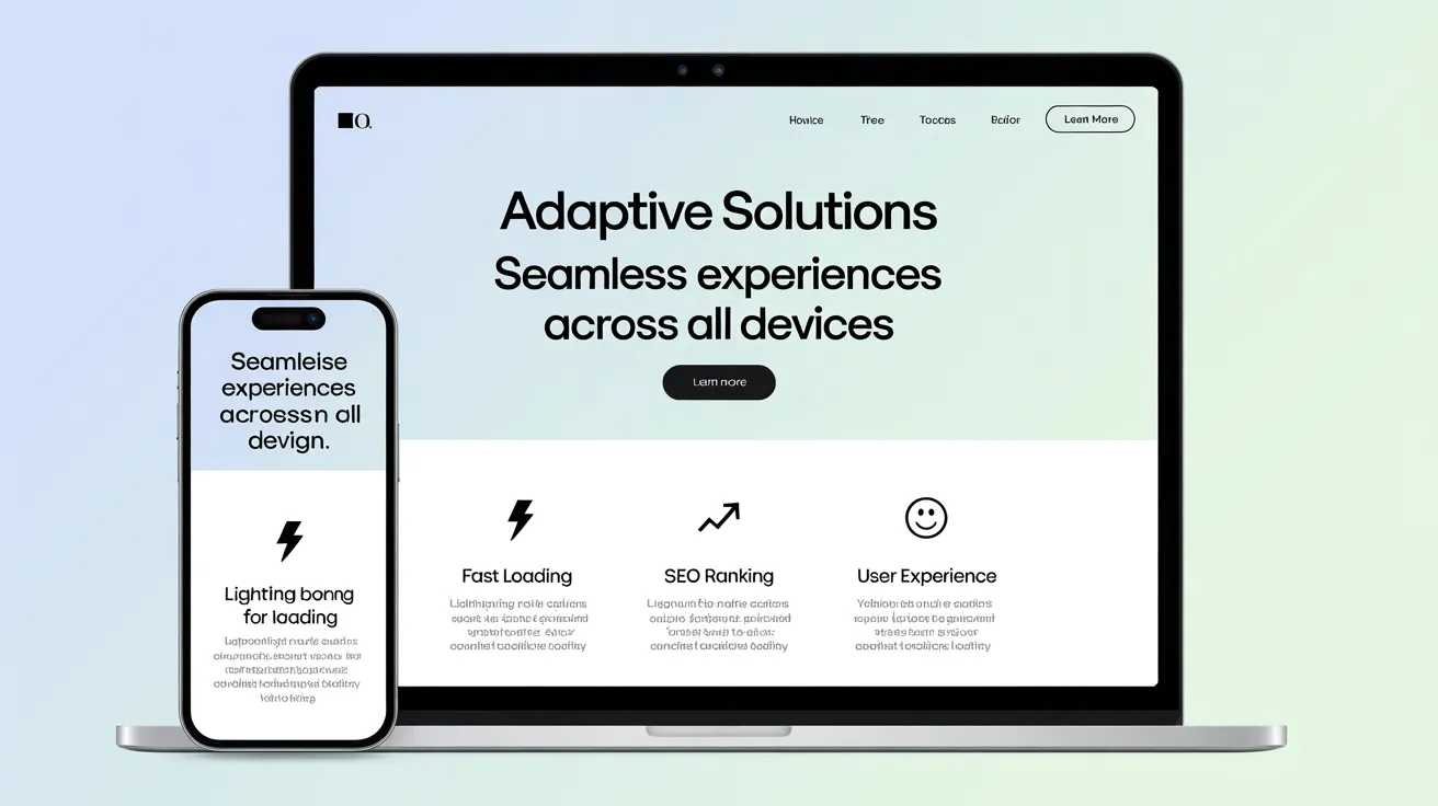
A mobile-friendly website is built to automatically adapt to any screen size and deliver an excellent user experience on mobile devices.
An optimized mobile site should:
The most common way to achieve this is through responsive web design, where the site’s layout adjusts based on the device being used.

Your visitors are often on the go, scrolling during a commute, standing in line, or multitasking at home. They want:
If your site is clunky or slow, they’ll bounce within seconds.
Example:
A local restaurant redesigned its site to be mobile-friendly. Customers could view the menu and book a table in just two taps. The result? A 30% increase in reservations within three months.
Google’s mobile-first indexing means your mobile site is the primary version Google considers for ranking.
If your site isn’t mobile-optimized:
Mobile optimization is SEO optimization; you can’t rank high without it.
Mobile visitors tend to act quickly. They might:
If your mobile site makes these actions difficult, you’re losing sales daily.
💡 Fact: Businesses with mobile-optimized websites often see conversion rates up to 160% higher than those with poor mobile performance.
Your website is often the first impression someone has of your business.
A clean, responsive design says:
✅ “We’re modern.”
✅ “We care about our customers.”
✅ “We’re trustworthy.”
But a broken mobile site says:
❌ “We’re outdated.”
❌ “We cut corners.”
❌ “We might not care about details.”
In today’s competitive market, perception matters.
Your website might be hurting your business if:
You can check instantly with Google’s Mobile-Friendly Test, a free tool that highlights problem areas.
To ensure your site works perfectly on mobile devices:
💡 Pro Tip: Don’t just test your homepage, check product pages, service pages, and your contact form to ensure they’re all mobile-ready.
Q: Can I make my existing website mobile-friendly without rebuilding it?
A: In many cases, yes. If you’re using WordPress, Wix, or Squarespace, you can switch to a responsive theme. However, if your site is built with outdated code, a complete redesign might be faster and deliver better results. The good news is, the process is not as daunting as it may seem, and the results are well worth the effort.
Q: Do I need a separate mobile website?
A: Not in 2025. The standard is one responsive website that adapts to all devices. This is better for SEO, easier to maintain, and offers a consistent brand experience.

Your customers are mobile. If your website isn’t, you’re falling behind.
A fast, responsive, and easy-to-use mobile site:
And the best part? You don’t need a massive budget to make it happen, just wise design choices and a focus on user experience.
💡 Action Step: Test your website today. If it’s not mobile-friendly, take steps now to fix it. Every day you wait is another day you’re losing customers.