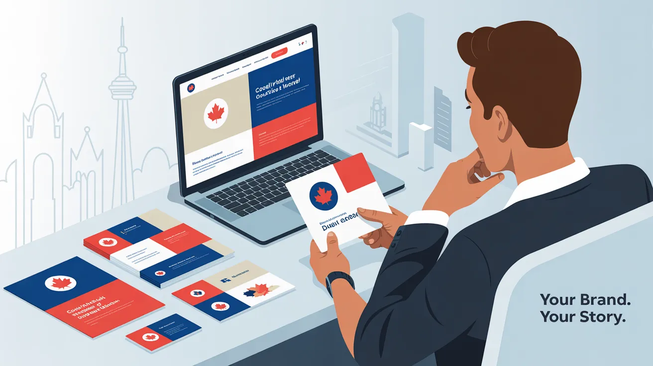
If your brand looks different on your business cards than it does on your website, you’re sending mixed signals to your customers, and mixed signals can cost you sales.
In today’s competitive market, small businesses, local service providers, and entrepreneurs in Canada can’t afford to confuse their audience. Whether you’re printing flyers for a local event or launching a new website, your brand’s look, feel, and voice should be instantly recognizable everywhere.
At Webby Guy Studio, we’ve seen firsthand how brand inconsistency can weaken trust and hurt conversions. But when your print and digital materials work together, you build credibility, strengthen your message, and attract more loyal customers.
Here’s how to make that happen.
Brand consistency means making sure every touchpoint, online or offline, looks, feels, and sounds like you.
Think about big Canadian brands like Tim Hortons or Canadian Tire. Their colors, fonts, tone, and messaging are consistent across TV ads, Instagram posts, in-store signage, and websites. That consistency builds trust and familiarity, making them memorable.
For small businesses, consistency can:
If you want your website, brochures, business cards, and social media profiles to all work toward the same goal, winning more customers, you need a clear strategy.
Before you start designing or redesigning your website, or before you send your logo to a printer, you need to know exactly what your brand stands for.
Your brand identity includes:
Example:
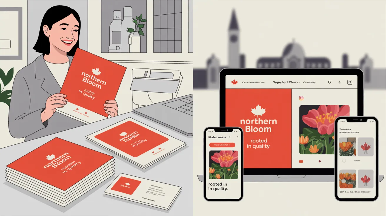
If you’re a landscaping company in Ottawa, you might choose earthy greens, a clean sans-serif font, and a friendly, helpful tone in all your copy. This same style should appear on your website, business cards, truck decals, and Instagram posts.
💡 Pro Tip: At Webby Guy Studio, our website redesign services always start with a brand audit to make sure your digital presence matches your offline identity.
Repetition isn’t monotonous; it’s branding.
Whether you’re working on a printed brochure or updating your homepage, use the same:
Why it matters:
If your Facebook ad uses a bright orange background and your flyer uses pale yellow, customers might not realize they’re from the same business. That’s a missed connection, and possibly a missed sale.
Consistency isn’t just visual, it’s also about what you say and how you say it.
Ask yourself:
Example:
If you’re offering “Free Winter Tire Storage” on printed flyers for your Toronto auto shop, make sure that offer is also:
At Webby Guy Studio, we help small businesses create effective SEO strategies that ensure their online and offline promotions are in sync.
A brand style guide is your playbook for maintaining consistency. It should cover:
By documenting your standards, you make it easier for everyone, designers, printers, and social media managers, to keep your brand aligned.
Pro Tip: If you don’t have a style guide yet, Webby Guy Studio can create one for you as part of our local business website tips package.
One common mistake is focusing too much on either print or digital, but not both.
Nothing kills credibility faster than a pixelated logo on your website or blurry text on a flyer.
Brand consistency works best when your print and digital materials complement each other.
Here’s how:
Example:
A Vancouver café runs a “Buy One, Get One Free Latte” promotion. They:
The result? Customers recognize the offer instantly, no matter where they see it.
Juggling multiple freelancers for your logo, website, flyers, and ads often leads to inconsistency.
By working with a single partner like Webby Guy Studio, you ensure that:
Our website conversion strategies don’t just focus on making your site look good; they ensure your entire brand communicates clearly and effectively, both online and offline.
Your business will evolve, with new offers, seasonal campaigns, and updated services, but your core brand identity should remain the same.
To stay consistent:
If your print and digital branding feel disconnected, you’re leaving money on the table. Customers need to recognize and trust your business instantly—no matter where they find you.
At Webby Guy Studio, we specialize in helping Canadian small businesses unify their brand presence, increase recognition, and boost conversions. From website redesign services to SEO-driven marketing strategies, we’ll make sure your business stands out for all the right reasons.
✅ Identify gaps between your print and digital branding
✅ Get actionable steps to align your visuals and messaging
✅ Learn how to boost customer trust and increase sales
📞 Request Your Free Consultation Now or call us at: 1 (844) 420-2632
Final Thought:
Inconsistent branding is like speaking in two different voices; it confuses people and pushes them away. But when your print and digital media work together, you tell a clear, compelling story that customers remember.
Make your brand unforgettable.
Let Webby Guy Studio help you own your presence, online and offline.